
Course Notes: Data Science for Business
These are my notes on the “Data Science for Business” course (TECH-GB 2336) offered at NYU Stern by Chris Volinsky.
What is Data Science?
The science of extracting knowledge and insights from data.
Examples of Data Science Projects:
- Network Analytics
- Social Networks and Marketting
- TV and Video Consumption
- Content Recommender Systems
Data Science Process
We will be focussing on the CRISP Data Mining Process (CRISP-DM = Cross-Industry Standard Process for Data Mining)
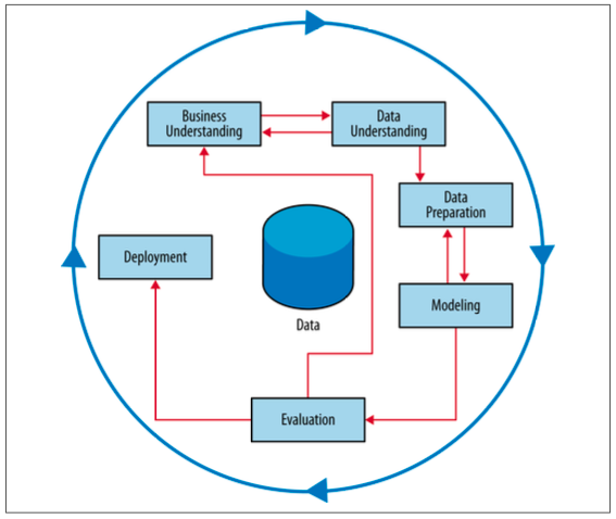
Business Understanding
In this stage, the analysts’ creativity plays a large role. The key to a great success is a creative problem formulation by some analyst regarding how to cast the business problem as one or more data science problems. High-level knowledge of the fundamentals helps creative business analysts see novel formulations.
One way to improve understanding is to try and break the big questions into smaller questions that are answerable by data.
Big Questions
- How do we increase revenue?
- How do we diversify customers?
- Why is customer satisfaction down?
Small Questions
- What are the properties of high-performing stores?
- Which population segments are buying less?
- What strategies reduce customer service hold times?
We will also improve our business understanding by asking the right questions to different stakeholders. This also means that we need to communicate our results to different groups in different ways.
Stakeholders
- Executive
- Sales
- Marketing
- Technology
- Operations
Questions to ask
- What is the goal of the solution?
- What data is available?
- What constraints exist?
- How do we evaluate?
- What does success look like?
- How will people act on the results?
Data Understanding
It is important to understand the strengths and limitations of the data because rarely is there an exact match with the data science problem you’re trying to solve.
One should know where the data comes from, we should connect with the teams that collected the data and understand how it was created. Secondly, we also need to know how to get the data from these teams, what systems or tools we require. Next, we understand the data by conductive exploratory data analysis (EDA). Finally, we also need know the limits of our data, and spend time cleaning, understanding it.
Data Preparation
This stage involves transforming our data for modelling by conducting exploratory data analysis, missing data analysis, outlier detections and assesment, feature engineering and data munging.
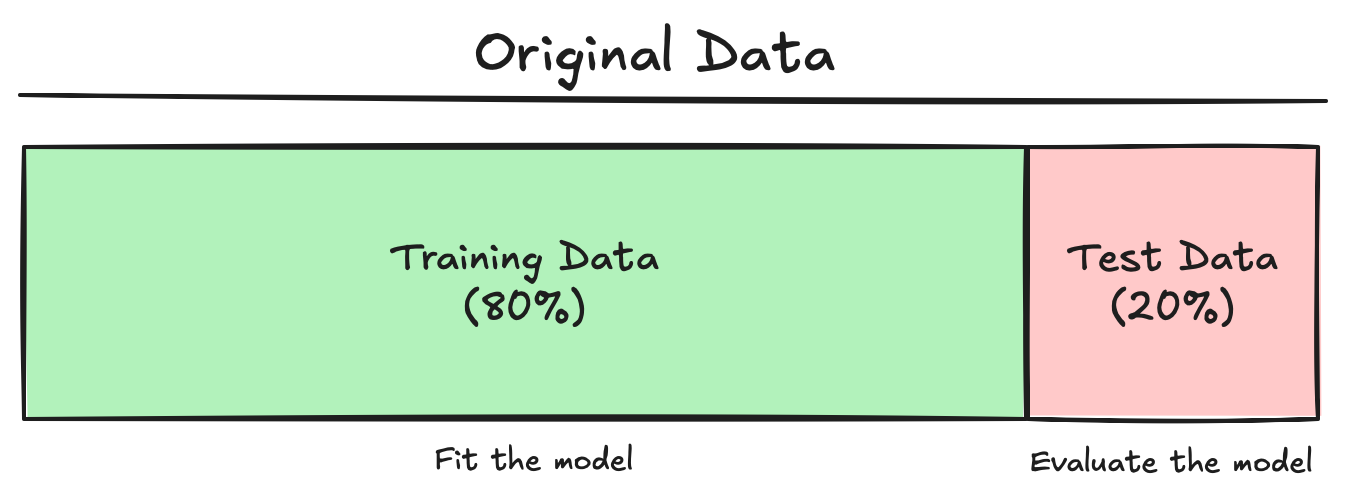
One of the core concepts in data science and machine learning that separates it from statistics is the splitting of data into training and test sets.
We randomly partition the labelled dataset into training and test sets.
- Training set is a random selection of input data points (usually between 70%-90% of the original dataset size) which is used to build the model and estimate the model parameters.
- We use the test set (a.k.a. “hold-out set”) which consists of the remaining data (10%-30% of the original dataset size) to asses the model’s performance. We generate estimates of the “generalization error” - model’s error on the test data.
Modelling
This is the stage where we apply machine learning algorithms to make predictions.
Evaluation
The purpose of the evaluation stage is to assess the model results rigorously and to gain confidence that they are valid and reliable before moving on to deployment.
We must define numerical metrics to determine the best model or the appropriate model paramters to use. Some examples are RMSE (root mean square error), MAE (mean absolute error), ROC Curves (receiver operating characteristic curves).
The evaluation metric should be tied to the business problem. For example, in a recommender system, the popular items should score well. It is also important to understand how the metrics translate to practical significance, such as, what does RMSE mean for our particular use case. You may find that the “best” performance might not actually have practical significance.
Always ask: is the success metric of the evaluation aligned with the business need? We could compare our model’s result to some baseline, or dumb models.
Deployment
One critical aspect of every data science exercise in business is: what action will be taken?
Models don’t have any business value until they get into production. Deployment decisions can effect the impact of the model. That is, deployments always has suprises. One way is to deploy slowly with pilot studies and A/B testing with careful monitoring and feedback loops.
Data science and the deployment teams (software engineers, DevOps, QA) should be integrated from the start to avoid any technical surprises.
The CRISP-DM process should not stop here. It should iterate and continously improve!
Types of Data Science Tasks
Supervised Learning
- There is a specific quantifiable target that we are interested in or trying to predict.
- Example, predict whether a customer will buy our product based on his/her browsing habits of our website.
- Algorithms like Decision Trees, Regression are used.
Types of Supervised Learning Models
- Classification: The prediction variable is categorical (perhaps binary). Example, will the loan application default on their loan?
- Regression: The prediction variable is numeric (continuous). Example, how much money will this customer spend on my product next year?
- Time Series: Here the data is time based, and we are forecasting into the future. Example, what will my company stock close at next month?
- Other Models: Predicting text or any other media. Example, what should my customer care chatbot say next?
Unsupervised Learning
- There is no such quantifiable target, we are just trying to understand the data.
- Example, segment customer base into clusters that help define broad customer types.
- We use data visualizations, segmentation, clustering in this.
Exploratory Data Analysis
Understanding your data goes hand and hand with the business problem you’re trying to solve.
Finding Data
- In business critical systems, the main challenge is data cleaning. The systems are often set up for collection of data, as they are for running a business.
- We can find data online, but companies do not share critical data, and if they do, it is via a rate limited API. To collect online data, we can use parsers, scrapers, and other tools. BeautifulSoup is a python module that can be used to scrape websites. We could also use GenAI to get data.
- We cane rely on curated data science websites like UCI repository. The challenge in this case is that the dataset is sanitized and already much analyzed.
Reading Data in Python
Ideally the data that we will access will come to us in a nice Excel or CSV. However, this is not true in real life, we need to deal with database accesses, SQL or streaming data.
Reading the data in CSV requires the pandas module and the pd.read_csv() function, with the file name or the URL of the data.
Exploring Data through EDA
- Study and understand each feature
- Know the feature types and distributions
- Identify outliers
- Consider data transformations
- Identify missing data
- Visualize the data
Feature Types
- Numeric: Features where calculations are meaningful
- Categorical: Features where we cannot do meaningful calculations. They can be multivalued, or might have numeric labels. Also check how the categories are ordered:
- Ordinal: Income (A: 0-50k, B: 50k-100k, C: 100k-500k, D: >500k)
- Nominal: Eye color (A: Blue, B: Brown, C: Green, D: Other)
- Binary: Only two possible values - 0 and 1. (it is a special case of categorical feature type)
- Date Stamps: Always check the date format. They can be considered as a numeric if not treated carefully. (Python uses
datetimelibrary)
Things can get messy very easily. For example, data about names, SSNs, credit ratings, zip codes, text, images or sound. You need to make sure that the software recognizes the right data type.
Manipulating data in Python
- Renaming variables (
.rename) - Summaries of variables (
.infoand.describe) - Exploring data (
.headand.tail) - Viewing slices of data (
.locand.iloc) - Categorical variables (
.value_counts) - Merging and splitting attributes (
.concat,.split) - Also can use sampling if the data is too large (
.sample)
Encoding Categorical Variables
For example, we have categorical data for diet types: vegan, vegetarian, pescatarian and omnivore. We can recode this variable as k binary (0, 1) indicator variables (also called as dummy variables or one-hot encoding). Note that: we only need k - 1 dummies to encode the information.
For some methods (like regression) you must encode with k - 1 dummies to avoid an error.
| Category | isVegan | isVegetarian | isPescatarian |
|---|---|---|---|
| Vegan | 1 | 0 | 0 |
| Vegetarian | 0 | 1 | 0 |
| Pescatarian | 0 | 0 | 1 |
If all values are 0, then it belongs to Omnivore category.
You can use the pd.get_dummies(drop_first=True) or sklearn.preprocessing.OneHotEncoder(drop='first') in Python.
Another issue with dealing with categorical variables is that there can be too many levels, which can make the model complicated and messy. We may then want to transform the data only to the top levels and an ‘others’ category.
Outliers
Outliers are observations that are far from the mean, and fall outside the range of most of the data.
We can find outliers using summary tables, data visualization or simple data sorting.
Outliers typically are attributable to one of the following causes:
- The measurement is observed, recorded or entered incorrectly (e.g. blood pressure = -50)
- The measurement comes from a different set of population (e.g. age = 5 in a data about adults)
- The measurement is correct, but represents a rare (chance) event (e.g. people with net worth of billions of dollars in a dataset about general population)
Outliers should always be considered and inspected to see if they are “real” or some artifact of data collection.
To Remove or Not To Remove
- Outliers can have an outsize impact on analysis. You may choose to remove an outlier, even if it legitimate, just to avoid influence on the analysis.
- You can choose a robust analysis technique like Decision Trees. Regression is sensitive to outliers.
- Carefully assess data for legitimacy. If appears incorrect, remove it.
- Do not blindly use the automated outlier-finding algorithms (like IQR rule)
Skewed Data
Highly skewed data can be problematic in data science analysis, especially with regression models (linear and logistic). Such skewed data can obscure pattern and invalidate statistically tests. One way to resolve skewed datasets is by using log-scale, square roots, or binning.
Missing Data
Data points that are not recorded or are absent in the dataset are missing datapoints. They can be represented as ‘.’, ‘NA’, ‘-1’, etc. (Python uses NaN for missing values)
Reasons for missing data:
- data entry errors
- non-responses in surveys
- system errors, etc.
Missing data considerations:
- How much is there?
- Is it missing at random?
- Is missing-ness important by itself?
- How does the model handle it?
Pandas functions - isnull() and notnull() are used to detect missing values.
Strategies for Missing Data
- Deletion Methods:
- Row deletion: remove the entire row if any value is NA
- Column deletion: delete features with high percentage of NA. (impact of analysis needs to evaluated, as it could be drastic)
- Imputation Methods:
- Mean/Median/Mode Imputation: replace all the NAs with mean, median or mode of the feature
- Modeled Imputation: use algorithms like regression or k-nearest neighbours to predict and fill missing values
- Interpolation: Give data points the average of the two observations surrounding it (relevant for time series)
- Create a new category for NA
It is important to evaluate how much influence does your strategy have on the final conclusions.
Pandas functions - dropna() is used to drop rows or columns with missing values, fillna() is used to fill missing values with a specific value or method (mean, median or mode).
ScikitLearn functions - SimpleImputer() applies basic imputation strategies and IterativeImputer() applies modelling based imputation.
Data Visualization
Looking carefully at the data is an important part of the exploratory process:
- to identify mistakes in collection/processing
- to find violations of statistical assumptions
- to observe patterns in the data
Sometimes a good, simple visualization is all the “analysis” you need.
However, data visualization is a challenging topic - very hard to do well - many design decisions to make. There are in-depth courses, that discuss the theories which cover things like - what do humans perceive well, how to use marks, colors, etc. Careful thought should be taken with the message you’re trying to convey with your data.
It is always best to start to simple with the basic building blocks of visualizations - histograms, boxplots, scatterplots.
Histograms
Histograms are probably the most used (and useful) way to present numerical data. They provide a quick view of the range, distribution shape, outliers and trends in the data.
The number of bins and bin-widths can have a role in the interpretation.
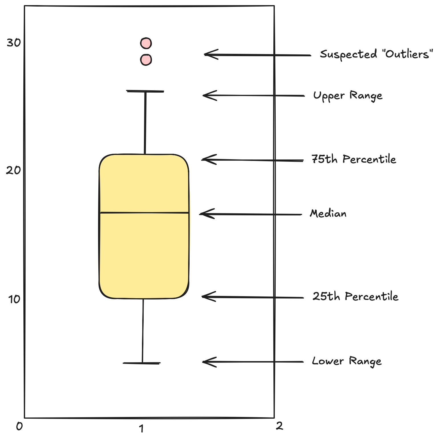
Boxplots
A boxplot is another way of getting a quick visual clue of the key points of the data distribution.
Multiple Variables
You can represent contingency tables using stacked bars, side-by-side bars or standardized bars.
Also, side by side boxplots allows you to compare numeric distributions across variables which are categorical.
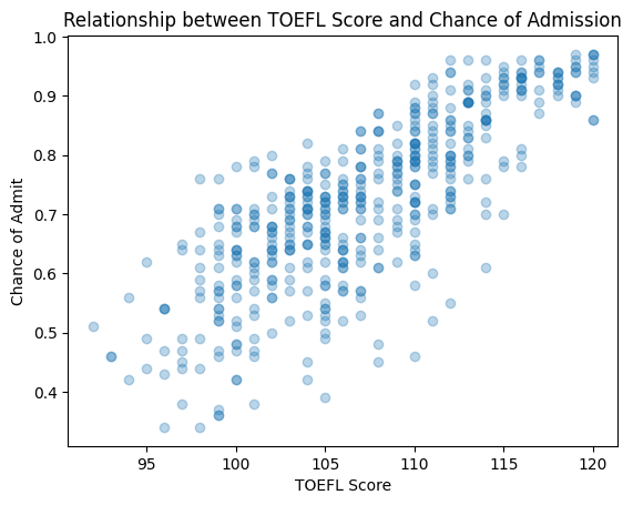
For multiple numeric variables, scatter plot is the standard tool. It can be used to display the relation between two variables. We can easily see if there is any correlation between the data points plotted on the x-axis and the y-axis, or we can even find any strange patterns in the data, identify outliers, etc. When you are dealing with overplotting, you can use “alpha blending” (i.e. transparency) or heatmaps.
From Exploration to Model Fitting
Fitting data science models, follows the same basic structure:
- Instantiate a model
from sklearn.linear_model import LinearRegression model = LinearRegression() - Identify X (predictors) and Y (target) and then create training and test sets.
from sklearn.model_selection import train_test_split X_train, X_test, y_train, y_test = train_test_split(X, y, test_size=0.2) - Use
.fitto apply the model to the datamodel.fit(X_train, y_train) - Explore the outcomes of the model
y_pred = model.predict(X_test) - Calculate model fit metrics
  from sklearn.metrics import root_mean_squared_error

  rmse = root_mean_squared_error(y_test, y_pred)
We do this over and over again.
Decision Trees
Decision trees are one of the most useful and interpretable ways to build a predictive, supervised machine learning model.
There are very easy to interpret.

- We start of with all the data.
- At each level, we create a rule that creates “branches” (typically 2).
- Each branch then can split independently.
- Each level is defined by a rule.
- Bottom level are called the “leaves”.
- Each data point falls in one and only one leaf
- Each leaf is defined by a set of rules that got us there
- Each leaf gets labelled with the majority class for those that fell in the leaf.
- Thus, new data can now be classified - every new instance goes to a single leaf.
Nodes
Numeric attributes are split at an “optimal” spot at the nodes
Leaves
Prediction for a new case is the majority class in the leaf node.
Class Probabilities
We can also assign a class probability to a new data point from the leaf node it falls into. Trees assign probabilities by looking at the proportion of the training labels that fell into each leaf node.
Probability Correction
\[ \text{Laplace Correction} = p(c) = \frac{n + 1}{N + 2} \]
Where \(n\) is the number of examples in the leaf belonging to the class, and \(N\) is the total number of cases.
Laplace correction is often used in cases with small datasets, to offset the impact of “overfitting”.
Overfitting
The larger you build the tree, the more accurate it gets… on the training set. 😕
Applying a tree against a test set allows us to determine the optimal size of the tree to maximize for generalization, and avoid overfitting.
Why Decision Trees?
Trees are one of the most popular models for supervised classification. Trees are easy to understand (when small), easy to communicate to executives and non-technical stakeholders, and they work pretty well for a simple model.
Trees are also computationally cheap for large datasets, can handle large sets of attributes easily, ignores irrelevant variables, handles missing data well, and doesn’t make any distributional assumptions (compared to regression).
Growing a Tree
There are two elements to a good split:
- “purity” of the branches
- “coverage” of the data
Measuring Impurity
The more homogeneous (consistent) a group is, the more pure it is. We measure purity with entropy:
\[ \text{Entropy} = - p_1 \log_2(p_1) - p_2 \log_2(p_2) \]
Entropy is maximized when the classes are equally distributed, and the least when only one class exists in the sample at a time. (Note: Entropy also extends to more than two classes)
\[ \text{Low Entropy} = \text{More Information} \]
How do we use Entropy?
- A decrease in entropy means more information
- We calculate entropy before and after the split
- We evaluate the potential split by taking the overall entropy of the split (a weighted average of the two entropies).
Measuring Coverage
Entropy gives us a measure of how helpful a given leaf is in predicting the target. But we need an overall sense of the value of the split. We want splits that increase our overall information, not just carve off little areas with perfect entropy. We do this by measuring the overall improvement in entropy across the entire dataset for each split.
\[ \text{Information Gain} = \text{Impurity (parent)} - \text{Impurity (children)} \]
Finding the Best Split
At each split we need to:
- Find the optimal split point for each numeric attribute
- Find the optimal split for any categorical attribute
- Compare the information gain of those splits for each attribute
- Pick the best one and split
However, if we follow these rules, we can keep splitting and growing the tree until we have perfect purity or we find no splits that can add information.
But we don’t want to grow as far as we can. Fewer nodes are typically better, more comprehensible and more accurate. Test (hold-out) sets will guide us in finding the optimal tree size.
Tree can also be interpreted geometrically - trees create rules that correspond to axis-parallel lines.
Information Gain for Insight
Each split of the decision tree results in information gain - decreasing entropy is information gain. We can assign the information gain to the attribute used for the split. Thus, information gain can give us a measure of feature importance.
Random Forests
Typically multiple trees (or forests) will outperform a single well-built tree.
Random Forests is a machine learning method that fits many different trees to a prediction problem - using random samples of rows and columns - and averaging the prediction across trees. This results in an improved predictive power, however, at the loss of interpretability.
from sklearn.ensemble import RandomForestClassifier
Evaluating Models
If we apply accuracy to trees built on the training set, the biggest tree will always be best. In fact, you can often build a tree with 100% accuracy on the training set. But the goal is to generalize to data we have not seen yet.
We split the data into training and test sets, so that it provides a better estimate of model performance in the “real world” and optimize the value of model parameters (e.g. tree_depth)
We typically have to scale back on model complexity in order to improve generalization error.
Complexity vs. Error
This is one of the most important concepts of machine learning:
- Models always get better (as measured on training set) with more data or more complexity
- But need holdout data to optimize generalizability
Overfitting: model is too complex: the model fits great on the training data but doesn’t generalize to holdout data becuase it is “memorizing” the training data.
Complexity parameters:
- Tree Models: number of nodes, min. leaf size
- Regression Models: number of features, degree of polynomial, interactions
- Neural Networks: number of layers, complexity of functions
Cross Validation
To get a better generalization error estimate, we need to account for the randomness of the split, by doing multiple splits. Cross-validation is one way to get around this.
Cross Validation Algorithm:
- Split data into \(k\) equal sets, called folds
- Fit model with sets \((1, \dots, k - 1)\), measure performance on fold \(k\). Subsequently fit \(k\) times using each fold as a hold-out.
- For each iteration, measure predictive performance, or the metric of interest
from sklearn.model_selection import cross_val_score

cross_val_score(model, X, y, scoring='accuracy', cv=5)
Leave One Out Cross Validation (LOOCV)
- Fit model on all but one data point
- Predict on the single data point and measure error
- Do that N times, once for each data point
LOOCV is the best in terms of estimating true error. But it can be very time-consuming, not necessary or larger data sets.
from sklearn.model_selection import LeaveOneOut, cross_val_score

loo = LeaveOneOut()
cross_val_score(model, X, y, scoring='accuracy', cv=loo)
Validation Set
- The test set serves two purposes: to find the best parameters and to estimate the out-of-sample error - so it is not really an “unbiased” estimate of error.
- In some cases, it may be useful to create a third parition of the data.
- This provides a truly untouched data set that gives the most accurate estimate of error
- Process:
- Put aside a random 10%-20%
- Split remaining data as normal into training and validation sets
- Use training/validation to set parameters (e.g. optimal tree_depth) and then simply apply to the holdout data
Evaluating Classification Models
Classification models predict what class an instance belongs to, by assigning a probability. We use a default cutoff of 50% for predicted probability, and determine the classification accuracy.
However using the default cutoff for 50% is not good. We need to choose a cutoff depending on:
- the baserate
- what action we intend to take
- the cost of the action we intend to take
- the distribution of the predictions
For example, we have a model which predicts who is likely to respond to a mail based on previous features. We assume that it costs $1 to send the mail and if the person responds, we get back a $10 donation; if the person doesn’t respond, we get no donations.
Looking at this, our prediction to action should be to sort the predicted probabilities of our customers and pick all the examples that have a high probability of responding. Let’s just say it is at 0.1 in our case, so our cutoff would be 0.1. The customers that have a predicted probability more than 0.1 will be targetted with a mail, as they are more likely to donate.
- False Positives (FP)
- we predict “positive” when it is not true
- False Negatives (FN)
- we fail to predict “positive” when we should have
In classification problems, we must consider the costs and implications of FP or FN. For example, you are predicting whether a patient has a disease or not, maybe a False Positive isn’t so bad, because you can just send for a different test.
Confusion Matrix
A confusion matrix is a way of presenting the FN and FP rates for a given prediciton.
| Truth=1 | Truth = 0 | ||
|---|---|---|---|
| Predicted = 1 | True Positives (TP) | False Positives (FP) | Total Predicted + |
| Predicted = 0 | False Negatives (FN) | True Negatives (TN) | Total Predicted - |
| Total True + | Total True - | Total N |
For a classification model, the cutoff used determines the FP and FN rate (calculated on a holdout set).
Every cutoff generates a classifier with a different confusion matrix.
We can also determine other metrics from a confusion matrix:
- Accuracy: \[ \frac{\text{TP} + \text{TN}}{N} \]
- Error Rate: \[ \frac{\text{FP} + \text{FN}}{N} \]
- Precision: \[ \frac{\text{TP}}{\text{TP} + \text{FP}} \] This measures the exactness of our model - out of those we labelled positive, what percent are we correct?
- Recall: \[ \frac{\text{TP}}{\text{TP} + \text{FN}} \] This measures the completeness of our model - out of those that are TRULY positive, what percent are we correct?
All these values change, when we change our cutoff.
Evaluation Curves and Metrics
To get the overall performance of a model, we have three curves - Precision-Recall Curves, ROC curves and Lift Curves.
- Baserate
- It is the overall prevalence of positive cases i.e. the percentage of the dataset that is true. For example, we have 35 true labels in a 100 datapoints datset, our baserate of success is 35%, and the baserate of failure is 65%.
A “dumb” model can always have accuracy atleast as high as the baserate of success (or failure).
A balanced dataset refers to how close the baserate is to 50%.
However, many use cases are highly unbalanced (e.g. fraud, where 0.1% or less are fraud cases):
- Models can ignore the minority class - challenge to get good recall
- Can perform poorly identifying minority class (often of most interest)
There are two solution to dealing the highly unbalanced cases:
- Sample from the majority class - get 50/50 datapoints
- Use
class_weght='balanced'- upweight minority cases
Precision/Recall Tradeoff
- High Precision:
- Use a high cutoff
- Want to be really sure that those predicted true are really true
- Use when the cost of a false positive is high
- Example: Medical Tests?
- High Recall:
- Use lower cutoff
- When you want be sure to get as many positive cases as possible
- Use when the cost of a false positive is not so high
- Example: Advertising? Fraud?
If you want the best of both worlds, you can use the F-measure
\[ F = \frac{2 \times \text{precision} \times \text{recall}}{\text{precision} + \text{recall}} \]
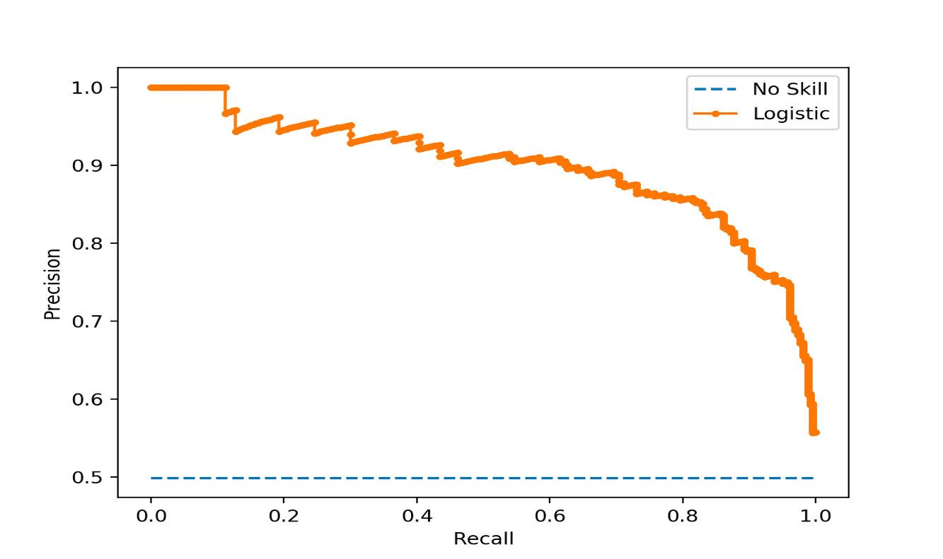
Precision-Recall Curve
In this curve, we plot the precision vs. recall for each possible cutoff.
When precision is 1.0, our recall is 0.0. When recall is 1.0 our precision is the baserate.
Precision and recall are useful metrics to compare two different models. That is, two models with the same precision may have different recalls, the one with the higher recall is better (i.e. better F-value).
One thing to notice - P/R curve doesn’t contain the actual cutoffs, it is determined by the ranking of the test data cases.
In fact, for some data science tasks, all that matters is that we rank the test cases, the actual probabilities don’t matter.
ROC Curve
ROC = Receiver Operating Characteristic
ROC Curves trade off - Benefit (true positive rate) and cost (false positive rate).
Each point in the ROC space corresponds to a different cutoff:
- Y axis = True Positive rate, i.e. recall, or “hit rate”
- X axis = False Positive rate, i.e. “false alarm rate”

Why are ROC curves good?
- The underlying probabilities are not relevant - we only measure the quality of the ranking.
- They are not impacted by the baserate - all curves go from (0, 0) to (1, 1), and it allows comparison of different models, even different data sets.
- It provides a single metric of performance for a given model, regardless of baserate.
AUC Score
AUC = Area under the ROC Curve
It is the calculated area under the ROC curve.
It has become the standard metric for ML models due to:
- It measures the overall ranking quality of the model
- It is bounded between 0 and 1
- Interpretation: It is the probability that model will rank a positive case higher than a negative case
- It is independent of the baserate
- A value of 0.5 means it is not better than a random model (i.e. a higher AUC socre is always better)
Lift Curves
ROC curves are good for showing across the entire dataset how well you compare to a “random” model.
In some cases, for example, churn, we can only offer a deal to a maximum of 3% of our customers. We need analyze how much better is our model than a blind selection of 3% customers.
Lift curves directly address this question.
Lift: improvement obtained over randomness (a.k.a. the value of the model).
To calculate lift, we need to look at the cumulative response curve (also called cumulative gains curve)
Cumulative Response Plots
- True poisitve rate on y-axis
- Percentage of population targeted
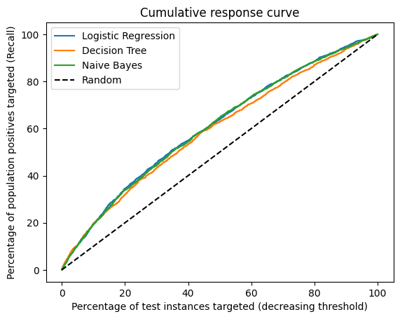
Lift Curve plots the lift from the Cumulative Response Curve in order to highlight the improvement over the random model - particularly at the points of highest precision.

Which curve to use?
- ROC Curves (and particularly AUC) are a standard way to give overall performance of a model and compare between models.
- P/R Curves allow you to clearly see the balance between precision and recall. But they depend on the baserate and so not comparable between datasets.
- Lift Curves are used when “overall” accuracy is less important and you really care about how well you can “slice off” the most likely cases
- Can be field specific (if you are dealing with marketing, lift curves are preferred)
- As always, choosing the right curve depends on the business problem, the audience and the need for interpretability.
Evaluation using Expected Value
Different errors (false positives or false negatives) might have different costs based on the problem. Similarly, the benefit of getting the right classification might have different benefits. The expected value framework is a way to incorporte these directly into the evaluation - and aslo help to set the cutoffs.
Cost/Benefit Matrix
In a non-profit marketing example, it costs $1 to send a solicitation and assume that if someone donates they donate on average $10. We can calculate the net cost/benefit matrix as:
| Response = + | Response = - | |
|---|---|---|
| Solicitation = Y | B(Y, +) = 9 | B(Y, -) = -1 |
| Solicitation = N | B(N, +) = 0 | B(N, -) = 0 |
where, B = benefit (can be negative if there is a cost)
The expected value of money you make if you send the solicitation depends on the probability of them responding:
\[ \text{EV}(\text{solicitation}=\text{Y}) = P(+|Y) \times B(Y, +) + P(-|Y) \times B(Y, -) \]
Let \(p\) be the probability that they respond (from the model)
\[ \text{EV}(\text{solicitation}=\text{Y}) = p \times 9 + (1 - p) \times (-1) \]
\(EV > 0\) if \(p > 0.1\), so you would act if the probability is greater than \(0.1\).
Similarly, \[ \text{EV}(\text{solicitation}=\text{N}) = P(+|N) \times B(N, +) + P(-|N) \times B(N, -) = 0 \]
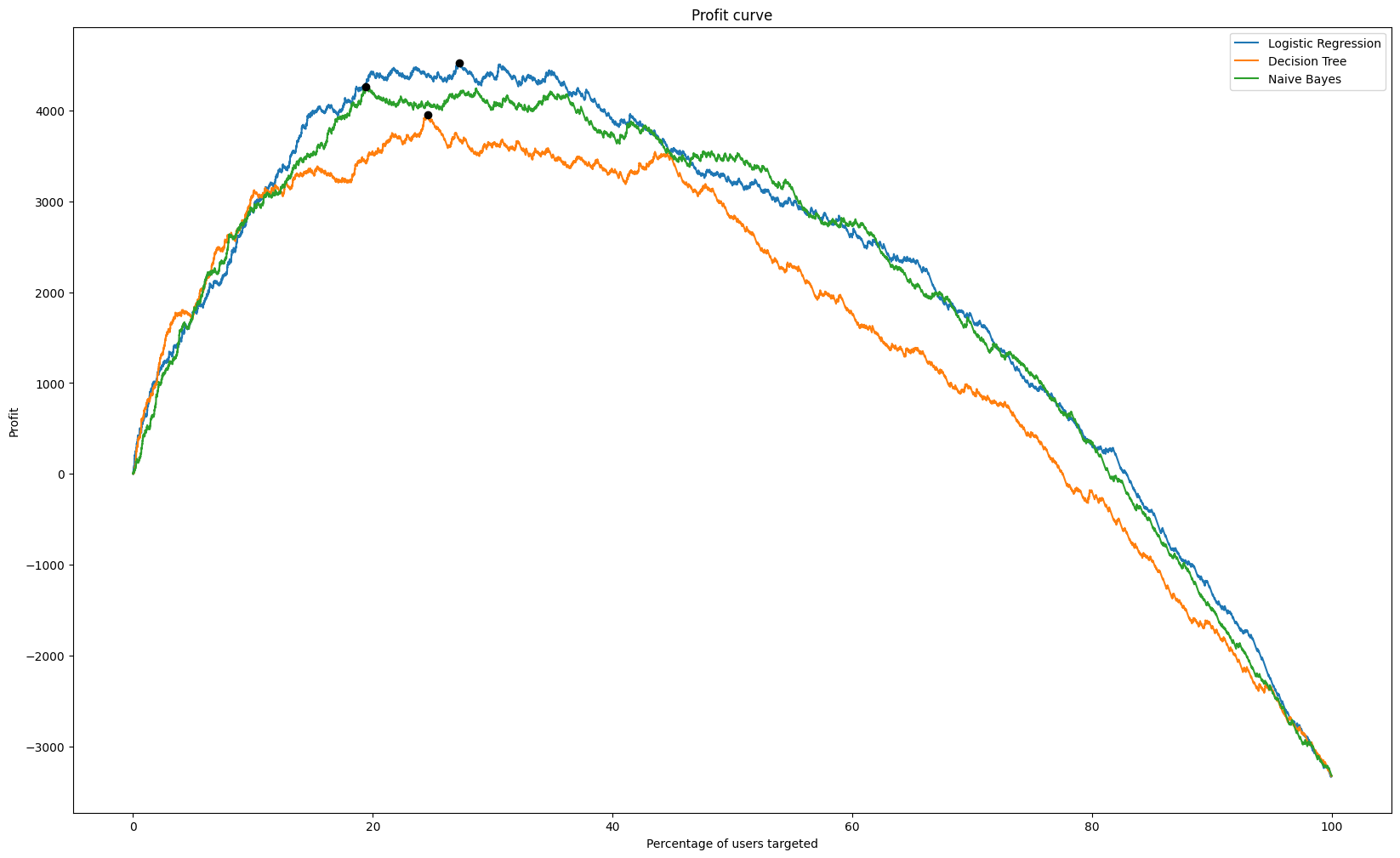
Profit Curves
If you make some assumptions about the costs and benefits of your actions, you can use profit as a way to evaluate your models and set curoffs.
More generally, the profit of a given model is a combination of the cost/benefit matrix and the confusion matrix.
\[ \text{Profit} = \frac{TP \times B(TP) + FP \times B(FP) + FN \times B(FN) + TN \times B(TN)}{N} \]
In a profit curve, we calculate the profit for every threshold and select the maximum.
Feature Engineering
The features you get are not the only features you want to use. We can either remove features for complexity control, or we can create new features - feature engineering.
Here are some feature engineering techniques that we can do before modelling:
- Convert numeric variables to categorical
- define highest 10% or H/M/L categories
- binning of target or attribute to account for long tail
- Dates: extract year/month/hour from date as separate features
- Calculate useful features from dates (tenure, duration, last seen)
- Combine columns
- mean, max, min or total might be more relevant than individuals
- Create aggregatees
Text Mining
- Automatically extracting meaning from a document
- Label a document into one of many known types - library categorization, multi-class classification
- Clustering documents into useful groups - unsupervised learning
- Query a set of documents for search or to find most similar ones - e.g. legal precedent, patent search
Text-based learning often requires a large collection of documents to learn from - a corpus - that needs to be pre-processed significantly before analysis.
Text is more than just words, and understanding language (NLP) is a technical field all to itself:
- “Hitchcock shot The Birds in Bodega Bay”
- “Lets eat, Grandma!”
- “I can’t recommend this person highly enough”
Processing
Language is notoriously messy! Looking at every word as its own entity might not make sense.
- Not all words are important
- Some words mean the same thing
- Tenses
- Spelling
- Phrases that might not make sense to break up: “data science”
We do the following pre-processing steps for text:
- Remove symbols and punctuation
- Stop-word removal (
from nltk.corpus import stopwords)- e.g. “the”, “is”, “in”, “a”, “at”, “for”, “where”, “when”
- but be careful - “not”, “very” and “the” can be important in some cases (e.g. “The Batman”)
- Case correction (
String.lower()) - Stemming - eliminate suffixes from words (
from nltk.stem import PorterStemmer)- “walking”, “walk”, “walked”, “walks” > “walk”
- lemmatizing can go further (“see”, “saw”)
- Spell correction (
pySpellChecker, JamSpell, textblob) - Tokenizing using subject matter expertise
- Remove rare words - words that occur only once might overfit
- Synonym lookup and replacement (
word2vec)- “travel”, “vacation”, “trip”, “journey” > “travel”
Bag of Words
Bag of Words is simple and convenient, but it ignores the grammar, word order and sentence structure.
Example: “This loan request is to reduce credit card debt by receiving a more manageable finance charge and payment schedule than what I am currently paying on a monthly basis. I currently meet all my financial obligations without problems. This allows quicker debt reduction.”
Bag: {without, what, to, this, this, than, schedule, request, reduction, reduce, receiving, quicker, problems, payment, paying, on, obligations, my, more, monthly, meet, manageable, loan, is, financial, finance, debt, debt, currently, currently, credit, charge, card, by, basis, and, am, allows, all, a, a, I, I}
This is known as tokenization: taking a document and reducing it to its terms.
Term-Frequency Table
After all of the counting and processing, we now have a structured Term Frequency (TF) data set for analysis - which words appear in which documents. \(TF (d, t) = \) number of times \(t\) appears in the document \(d\)
Simple version - binary matrix - does word exist or not?
This can used for both - supervised (regularized logistic regression, Naive Bayes) and unsupervised models.
In a term-frequency table, we can normalize to account for that fact that some documents that have more words i.e. we divide each number by the words in its own document.
Inverse Document Frequency (IDF)
A term that is too common is not distinguishing, and therefore not useful for classification or clustering (stopwords, but others too).
Thus, the fewer documents a word appears in, the more significant it is when it does appear!
\[ IDF(t) = \log \left( \frac{\text{Total number of documents}}{\text{Number of documents containing term }t}\right) \]
IDF is the boost a term gets for being rare. And rare terms have high IDF.
TFIDF
A term is important for a given document if it has - high term frequency (it appears a lot), high IDF (it doesn’t appear in other documents as much).
We combine the TF and IDF matrix by multiplying them,
\[ \text{TFIDF}(d, t) = TF(d, t) \times IDF(t) \]
High values of \(\text{TFIDF}(d, t)\) mean that term \(t\) has importance in the context of document \(d\).
TFIDF matrices are the vehicle for doing ML on collections of texts. We can do classification, clustering, search on text.
from sklearn.feature_extraction.text import TfidVectorizer
Naive Bayes
Conditional Probability: For any two events \(A\) and \(B\), the conditional probability is given as,
\[ P(A|B) = \frac{P(A \text{ and } B)}{P(B)} \]
Thomas Bayes came up with Bayes’ Rule in the 1800s by just turning around the rule of probability
\[ P(A \text{ and } B) = P(A|B) \times P(B) \]
\[ P(A \text{ and } B) = P(B|A) \times P(A) \]
\[ P(A|B) = \frac{P(B|A) \times P(A)}{P(B)} \]
Typically in data science we are trying to find the probability of some outcome (\(A\)) given some data (\(B\)).
Applying Bayes’ Rule in Data Science
Now we have reduced the problem to calculating,
\[ \frac{P(\text{features} | \text{Yes}) \times P(\text{Yes})}{P(\text{features})} \]
We make a naive assumption - that the features are conditionally independent:
\[ P(\text{features} | \text{Yes}) = P(f_1|\text{Yes}) \times P(f_2|\text{Yes}) \times \dots \times P(f_k|\text{Yes}) \]
These components are usually calculated from training data.
Why Naive Bayes for text?
- The conditional independence probability is very useful for text
- We have probably never seen that specific collection of words before
- But we have seen each word independently in both scenarios
- The individual probabilities are very easy to calculate
- Just counting when they occur
- Naive Bayes can be used for any predictive problem
- But the features have to be nominal categoricals (like words)
- If you have numerical features, you can run NB by binning them, but you lose the ordering, and have to treat them like nominal.
| Types of NB | Usage |
|---|---|
BernoulliNB |
Uses term occurance (binary) |
MultinomialNB |
Works with raw term frequencies |
GaussianNB |
Assumes continuous features and normality, not typically used for text |
ComplementNB |
Best for unbalanced data and TFIDF |
References
- Provost, Foster, and Fawcett, Tom. Data Science for Business: What You Need to Know about Data Mining and Data-Analytic Thinking. United States, O’Reilly Media, 2013.
- James, Gareth, et al. An Introduction to Statistical Learning: With Applications in Python. Germany, Springer International Publishing, 2023.
- Shmueli, Galit, et al. Data Mining for Business Analytics: Concepts, Techniques, and Applications in R. Germany, Wiley, 2017.
- Diez, David, et al. OpenIntro Statistics. United States, OpenIntro, Incorporated, 2019.